Wolt Case Study - Venue shopping exchange
Wolt case study
Introduction
As part of my work in Wolt's customer service in Israel, I encounter many inquiries that arise, among other things, from customer frustration with the deliveries they make. One of the frequent and recurring inquiries I receive relates to the replacement and removal of products from the shopping cart in supermarkets and food stores, a problem that, from my experience, stems from part of the process as it currently is in the product. In this case study, I will characterize the problem, the customers, and suggest a characteristic solution with the use of better UX writing.
But first, what is wolt
Wolt Enterprises Oy, trading as Wolt, is a Finnish company known for its delivery platform that enables the ordering of food and merchandise. Through Wolt's apps (iOS and Android) or its website, customers can order food and household goods from a variety of restaurant and merchant partners. They have the option to either pick up their orders or have them delivered by the platform's courier partners. .
.jpeg)
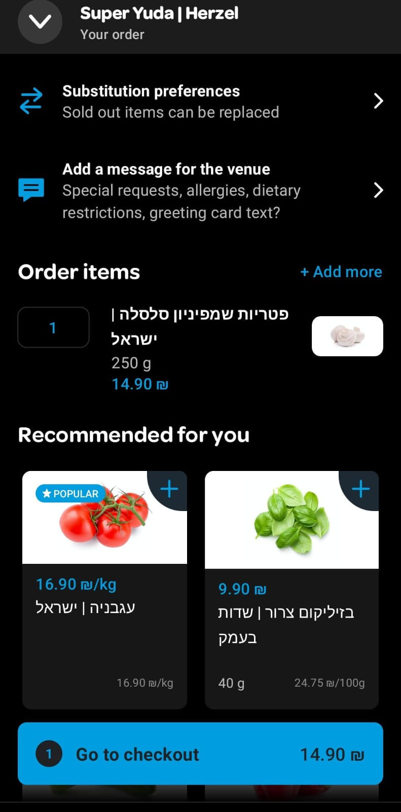
Can you easily spot
the subsitution feature ?
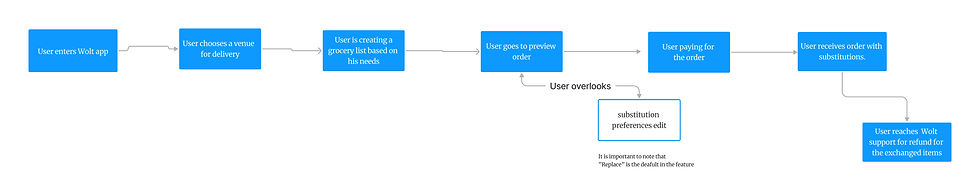
Defying the problem
Problem: Many Wolt users order their daily and weekly groceries through the app, saving time and freeing themselves for other tasks. However, partnering supermarkets experience frequent inventory changes, leading to items running out unexpectedly.
Issue: Although Wolt features an option for supermarkets to replace out-of-stock items with similar ones, many customers complain about unauthorized substitutions or deletions from their shopping carts, causing dissatisfaction and frustration with the service.
.jpeg)
Subsitution frame
How it looks like ?
Heading 6
Venue name
Recommended for
you
Message the venue
Payment
Grocery list
What may cause the problem ?
When I was researching what could cause users to miss messages for them in the system during usage, I decided to focus my search on cognitive psychology studies and existing research in the user experience field. Among other things, I recalled from the cognitive psychology courses I took during my degree that humans (users) often scan text rather than reading it thoroughly.
Scanning patterns -
In an experiment conducted in the 1960s in Russia by psychologist Alfred Yarbus, participants were observed while looking at oil paintings. Each participant had a different task to perform while viewing the painting. By using tests that measured where the participants focused during their observation, it was discovered that they concentrated on parts of the painting relevant to their tasks.
In the field of user experience, it's known that participants have tasks to complete (such as completing a purchase on Wolt) and that their motivation is to finish these tasks efficiently. Additionally, users typically first focus on the most prominent element on the screen and then scan the rest of the screen.
Based on the article from NNg
Cognitive overload -
Another factor that may cause users to miss messages is cognitive overload. Cognitive overload occurs when users are faced with many elements (such as text, buttons, and images) that capture their attention and can create confusion. On the Wolt purchase screen, there are six sections of varying sizes that overload the user and increase confusion.
On the screen, there are sections that attract more attention than others, such as 'Recommended for you' and the purchase confirmation button, which appear in a different color.
Payment
Subsitution
Grocery list
Subsitution
Venue name
Message venue
Recommedation
Heading 6
Based on the article from NNg
Add paragraph text. Click “Edit Text” to update the font, size and more. To change and reuse text themes, go to Site Styles.
Tami
32
Lives in Tel-aviv
Persona
Backround :
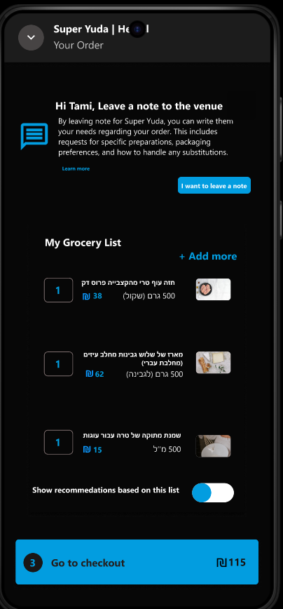
Tami is hosting her family for a Friday dinner. She wants, among other things, to make a cake in honor of the occasion and decides to order through Wolt. Before paying, she carefully checks the list to ensure she hasn't forgotten anything.
When the delivery arrives, she discovers that the type of heavy cream she needed for the cake has been substituted. Disheartened and angry, she contacts Wolt's customer service for a refund.
Motivation:
Tami's motivation is high. she wants to bake her family's favourite cake for which she needs a specific cream.
Pain points:
Tami is frustrated due to the exchange of the cream, because now she can not bake the cake.
she didnt noticed the subsitution section in the top of the screen.
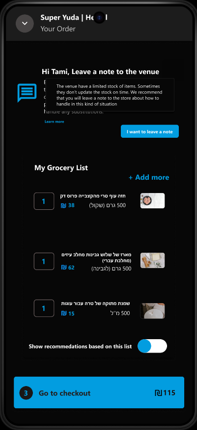
Possible soloutions
According to the studies I presented, factors such as cognitive load and the scanning behavior of users may cause issues. I have thought of several ways to overcome these issues and create a better user experience.
Soloution 1 - Is Pop up message good ?
One solution I considered is using a pop-up. A pop-up is a window that opens during system use and covers part of the screen (usually the top). It can be either modal, where the background is inactive, or non-modal, allowing continued interaction with the system. In this case, the pop-up would appear on the purchase screen, prompting the user to approve or reject substitutions for items in their cart.
However, research by NN/g indicates that pop-ups during the purchasing process often lead to frustration and confusion about why users cannot proceed with their task.
Tooltips are a product owner’s way of offering a friendly nudge towards key features to ensure that users fully understand how the app works and how to get maximum value out of it. They’re a great way to make sure users interact with the key features that will drive adoption, engagement, and retention
Conclusion : Since there are no tooltips in mobile devices the use of "Learn more" button is a possibility
Soloution 2 - Make it short does not always workout
One of the most important aspects in user experience is UX writing, often referred to as microcopy. This involves crafting text for buttons and system actions to reflect the system's state and simplify user actions, enabling successful completion. It is generally believed that text for users should be as concise as possible since people tend to scan rather than read thoroughly, and reading can be burdensome.
In episode 58 of the Mindesign podcast by Tom Even, guest Kinneret Yifrah mentioned that sometimes, longer text that clearly explains the importance of an action can lead to higher user cooperation in filling out forms. Thus, text that clearly instructs users on what to do is crucial to prevent confusion and future frustration.
Conclusion : A well explained message to the user might reduce the frustration when the delivery arrives.


Suggested soloution design
_edited.jpg)
Design Rational Explanation
Cognitive Overload-
To minimize cognitive overload, I streamlined the interface by organizing it into four main sections, compared to the six in the current (as of January 2025) version of the Wolt app. This restructuring not only enhances the visual appeal and cleanliness of the interface but also improves integration between the substitution options and messaging section, facilitating clearer and more direct communication with venues and restaurants.
Microcopy -
I developed user-centered microcopy incorporating clear calls to action (CTAs). The detailed and well-explained text emphasizes the significance of user actions and decision-making processes, guiding users effectively through their interactions with the app.
Conclusion and next steps
Next Steps -
In order check if the new design increases the percentage of customers who leave feedback for the venue regarding their orders compared to the existing design, develop the new design and perform a comparison of inquiries among existing users over a period that yields comparative data.
Conclusion -
In this project, I learned how, based on familiarity with an existing system, research, and daily interaction with Wolt users, better communication can be established between users at different ends of the system. I proposed using well-explained microcopy, reducing cognitive load, and implementing tooltips. Currently, this is just a proposal, but it would be interesting to test whether this design improvement enhances user experience through usability tests.
Thank you for reading, please check my other projects